FinOps as Code: Exploring Active Resource Data
Use FinOps as Code to explore all your active cost-generating provider resources.
An active resource is a resource, such as a virtual machine, that is currently generating costs within a cloud account. These resources come from a cloud provider, such as an Amazon EC2 instance or a Confluent cluster. It's important to know which resources are active and generating costs; otherwise, you could run into instances where things like S3 buckets start generating ridiculously high costs—and next thing you know, you're paying thousands in unexpected costs!
In this tutorial, we walk through how to use the Vantage API to explore how you can get insights from your active resources. We provide a script that lets you interact and view pivoted cost data across resource type, provider, region, and more. You can use these insights to understand where your organization is spending the most and what resources are currently generating the most costs. Consider this tutorial an introduction to even deeper analysis you can do with this API.
The Scenario: Visualize Active Resource Data
In this demo, you'll work along with the provided Jupyter Notebook to retrieve your active resource costs from the Vantage API. You'll use a few data visualization Python libraries to explore the data and make insights about your active resource costs.
Prerequisites
This tutorial assumes you have a basic understanding of Python, Jupyter Notebooks, and making basic API calls. For Vantage, you’ll need at least one provider connected with active resources. You’ll also need a Vantage API token with READ and WRITE scopes enabled.
The following Python libraries are used in the demo, so you'll want to be sure they are installed on your system:
You'll also need Jupyter Notebook or the ability to read ipynb files on your system to review the Notebook.
Demo: Visualizing Active Resources
Open the Jupyter Notebook and walk through each section described below. The code is also reprinted here for explanation purposes.
resources API Endpoint
The resources endpoint returns a JSON array of all resources within a specific Resource Report or workspace. The resource_report_token variable represents the unique token for a Resource Report in Vantage. For this lab, use the All Active Resources report that's automatically provided in your account.
- Navigate to the Resource Reports page in Vantage.
- Select the All Active Resources report.
- In the URL, copy the report token (e.g., in
https://console.vantage.sh/resources/prvdr_rsrc_rprt_a12f345345bad1ac, copyprvdr_rsrc_rprt_a12f345345bad1ac). - Replace the
<TOKEN>placeholder below.
Vantage API Token
Export your Vantage API token it as the VANTAGE_API_TOKEN environment variable within this session. When you run the below block, os will import the token as the vantage_token variable.
API Call and Pagination
When you initially call the /resources endpoint, the response is paginated. In addition, the Vantage API has rate limits in place to limit multiple calls. For this endpoint, the response is limited to 20 calls per minute. In the initial response, you should see the number of total pages that contain your resource data.
The following loop accounts for this rate-limiting and sets a delay between requests. It uses the X-RateLimit-Reset header to determine how long to wait before resuming requests to ensure that the rate limit is respected. If the rate limit is hit, the loop pauses for the specified time in X-RateLimit-Reset, allowing the process to continue, without interruption, once the rate limit resets. This loop also extracts and appends data from each page, moving through the pagination links in the "next" field until the final page is reached.
Note that retrieving this data may take a few minutes to process depending on the number of resources in your organization.
Creating a pandas Dataframe from the API Response
The /resources endpoint provides a resource record for each resource (identified by the Vantage token). Each unique token can have multiple entries, as cost is determined by the resource's category. For example, the following resource has one record for Data Transfer costs and another for API Request costs:
The pandas dataframe you'll create next pulls in the 'uuid', 'type', 'provider', 'region', 'token', 'label', 'account_id' for each resource as a record. In addition, the amount and category parameters are nested under costs. The record_path accounts for this. The record_prefix adds cost_ in front of each nested column name.
With the initial dataframe in place, convert cost_amount to a float so that you can accurately calculate total cost per resource type. The total_cost_df groups all tokens together to give a total cost per token.
With the data grouped and cleaned, you are now ready to make some visualizations and conduct some data analysis.
Viewing Data Visualizations
Now that you have the data, you can explore different visualizations using matplotlib.
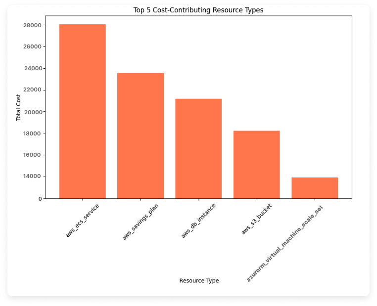
View Top 5 Cost-Contributing Resources
This first visualization looks at the top 5 cost-contributing resource types across all providers. A new dataframe groups by type and sums the cost_amount for each type.
From the results, you should see a graph that looks something like the below graph. (Note that we've used all sample data for the presented images.) The Resource Type axis shows each resource identified by a nomenclature from the Vantage API. You can find the equivalent name for each resource type in the Vantage Documentation. For example, aws_ecs_service represents the ECS Service.
Next Steps to Consider
- Consider what is driving those costs: Once you know the top cost-contributing resource types, consider investigating what factors contribute to their costs. You could look into your resource configuration options or usage patterns that might be driving these costs.
- Drill down by provider: If your organization uses multiple cloud providers, consider filtering the data to compare top cost-contributing resources by provider. If you use one provider (e.g., AWS) more heavily than others, then you can expect to see only that provider in the top results. The Notebook provides instructions for filtering to a specific provider using a filtered dataframe. We'll also conduct a heatmap analysis later that can help reveal some of these patterns.
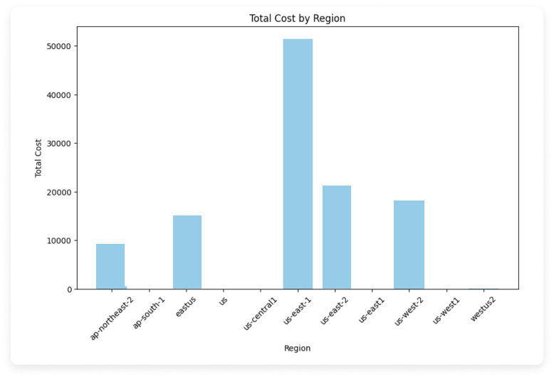
Explore Top-Costing Regions
Create the following bar chart with matplotlib to see costs per region across all providers.
The chart should look something like the below image. The region code is provided on the X-axis. This code will be specific to the related provider.
Next Steps to Consider
- Identify the highest-costing regions: Focus on the regions with the highest costs to determine what types of resources or services are driving these expenses. This analysis can help you to identify more cost-effective regions for certain workloads.
- Consider cost-reduction methods per region: Think about whether shifting resources to different regions might reduce costs without compromising performance. Some regions have lower pricing for specific services, and moving workloads to these areas, if feasible, could provide you with savings.
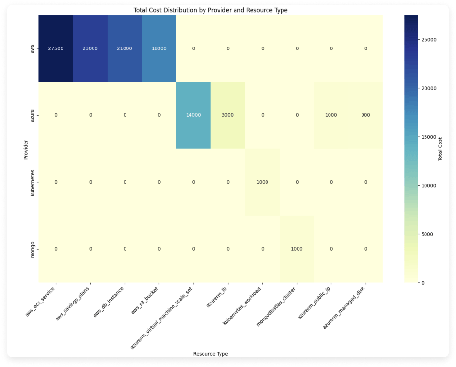
Analyze a Heatmap of Provider and Resource Types
A heatmap can help show clusters of resources across providers. This heatmap uses matplotlib and seaborn and creates a pivot table of provider and resource type and includes the top 10 highest-costing resource types for each. Again, you could also consider creating a filtered dataframe to see this data for only a certain set of providers. This additional example is provided in the Jupyter Notebook.
The heatmap should look something like the below image. Darker cells represent greater costs for that provider/resource type and show bigger clusters of data.
Next Steps to Consider
- Identify the highest-clustered resource types: Use the heatmap to spot which resource types have higher costs within specific providers. These insights can help you focus cost-optimization efforts on resource types where costs are notably high, especially if you have options for cross-provider services.
- Consider seasonality: If costs are clustered around certain resource types, investigate whether these resources have variable usage patterns, such as seasonal spikes. Identifying patterns in these high-cost clusters can help you focus on implementing new strategies, like scaling resources up or down based on demand.
Conclusion
It's important to track and analyze your active resources to avoid unexpected spikes in your cloud costs. The /resources API in Vantage allows you to dig deep into which resources are costing you the most across provider, region, account, and more. Consider creating more in-depth charts or tables to identify other patterns in your resource use and costs.
Sign up for a free trial.
Get started with tracking your cloud costs.


