Why We Are Migrating from Bootstrap to Tailwind
We're migrating from Bootstrap to Tailwind for more customization and a better developer experience. Gain insight into our migration strategy, how we're using Vue.js for complex components, and our design style.

Thierry Koblentz addressed issues with the separation of concerns—the principle that each element of the code should have a distinct responsibility—in his synopsis of Atomic CSS. He posited that the separation of concerns leads to “bloat, obsolescence, redundancy, [and] poor caching.” Atomic CSS favors a modular approach to styling that focuses on composing small, reusable classes for individual style rules rather than relying on large, monolithic stylesheets. While this piece was written over 10 years ago, these design considerations are still important today.
Over the past three years, our product needed to rapidly scale to accommodate new functionality and an increasing user base. Throughout the development process, we were often faced with a question of convenience vs. reusability. Our initial design system relied on Bootstrap, with many stylesheets for defining classes. Over time, this has led to greater “bloat,” more time debugging, and a greater learning curve as we brought on new developers. By reworking our frontend and migrating from Bootstrap to Tailwind CSS, we’ve enhanced our developer experience. We've also used Rails templates and Stimulus controllers to create reusable components. Now, we are also starting to leverage Vue.js to handle some of our more complex components. While the journey is not yet complete, we continue to learn and adapt our design system as we scale.
Here, we'll discuss how we are managing the migration, additional frontend considerations we've made to leverage Vue for complex components, and our design style.
Bootstrap or Tailwind: Out of the Box vs. Customization
Bootstrap is a powerful framework that provides out-of-the-box functionality for building web applications. It has a complete set of styles and reusable components that are perfect for fast-moving, high-growth applications. Bootstrap is considered an opinionated framework, meaning it generally has all the parts to quickly build a final product, but fine-grained customization can become challenging. In a small and fast-growing startup, Bootstrap was our preferred framework of choice. We could generally work with the out-of-the-box styles to develop functional, attractive UIs.
Tailwind employs a utility-first approach, meaning it provides a set of small utility classes—for example, a single-purpose class that defines padding. Tailwind is extremely customizable. You can style elements directly in your HTML markup, allowing developers to design within the browser. Our recent approach has been to embrace the concept of working inline and styling elements directly within the DOM, minimizing reliance on external design tools. You can create highly customizable components, and as a result, you reduce your reliance on numerous stylesheets.
Both frameworks have their pros and cons: Bootstrap provides out-of-the-box support for accessibility and browser compatibility but leaves you very tied to a specific style, while Tailwind allows for more customization but requires a solid understanding of how each low-level utility functions.
To illustrate a simple example, consider the following button element styled with Bootstrap:
The btn btn-primary classes are provided out of the box, and styles are managed separately in stylesheets. In Tailwind, the styles for this button are referenced inline as classes:
Here, Tailwind allows for better inline control over individual styles. In this example, if you wanted to adjust the padding on the button, you could change py-2 px-4 to py-3 px-6 without needing to create a brand-new class within a separate stylesheet.
Which Framework Wins?
Each developer is going to have a preference for their framework of choice, and we didn’t necessarily see one of these frameworks as being better than the other. Our decision to migrate from one framework to the other was based on weighing the tradeoffs of each approach: We had to be comfortable giving up some of the ease and benefits of Bootstrap to seek the exact customization we were looking for with Tailwind, and our journey is not yet complete. We recognize that there are—and will be—challenges that come along with this migration.
Competing Classes: Managing Tailwind Alongside Bootstrap
Our first challenge was to understand how we temporarily manage two design systems within one application. Customizations are defined in the optional tailwind.config.js shown below.
While we transition from Bootstrap to Tailwind, we need to differentiate between both frameworks and prevent collisions with common class names. For example, m-3 adds a margin of 16px in Bootstrap, while in Tailwind, m-3 adds a margin of 12px. The configuration above includes a prefix option to prepend generated classes with a prefix of your choice (e.g., tw-). With the prefix option enabled, we’re able to differentiate Tailwind classes from Bootstrap (i.e., tw-m-3). While this option does indeed temporarily add extra characters, it helps to distinguish Tailwind classes during the integration process.
Our default configuration also disables the preflight option. Preflight is “[a]n opinionated set of base styles” that attempt to normalize inconsistencies across browsers. The issue with this setting is that it can conflict with some Bootstrap classes. For example, margins are removed and headings are unstyled, which could lead to inconsistencies in the visual appearance of elements still using Bootstrap.
We also enabled the important option. When important is set to true, Tailwind adds !important to all its generated utility classes. This means that these utility classes will take precedence over existing styles, even if those styles have higher specificity. Once we are fully migrated off Bootstrap, a single line of code can undo the widespread usage of !important, promoting cleaner, more maintainable code.
Managing Our Components with Vue.js
The other part of our migration and frontend uplift focused on how to create easily maintainable components. Vue is a JavaScript framework for building user interfaces. It offers a component-based architecture, which makes it easy to separate complex UIs into reusable components. We saw Vue as a good option for developing UI components that require more heavy-handed frontend logic. While we continue to heavily rely on Stimulus, we have started to leverage Vue for more complex components that are built to handle multiple use cases across our UI. Our team found the Vue syntax and simplicity appealing, making it a preferred choice. We saw the following reasons as being supportive of our decision.
Built-in Directives
Vue offers built-in directives for handling DOM events, which simplify code maintenance and comprehension. For example, the v-on directive simplifies handling user interactions, such as clicks or keystrokes. We can use this directive to attach event listeners directly to HTML elements in our Vue components. This means that when a specific event, like a click, occurs on a particular element, we can specify a corresponding action or method to execute in response. These directives streamline common tasks and enhance the readability of our Vue components.
Consolidation of Components
We identified several components across our application that would benefit from consolidation using Vue. For instance, we have a few multi-select autocomplete components with asynchronous searching capabilities that are easier to maintain and reuse when implemented with Vue.
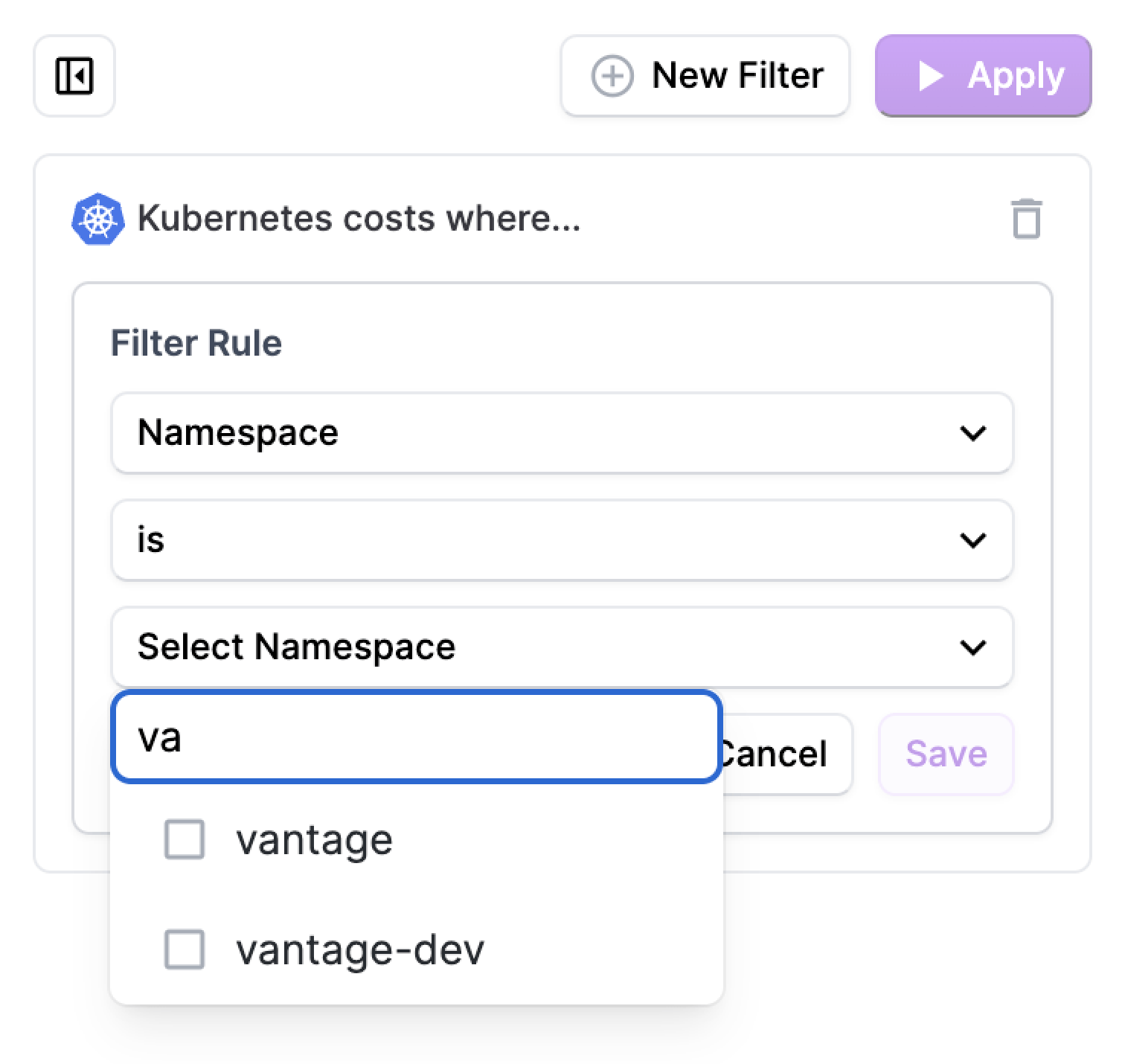
This filter sets component is easier to maintain in Vue due to its robust state management capabilities, which efficiently handle a large amount of frontend state. Vue's reactive data model and reactivity system streamline the process of managing complex state interactions, ensuring that changes to the underlying data are automatically reflected in the UI.
Debugging Ease
The Vue Devtools browser extension is a great tool for understanding the composition of components. This extra layer of support helps with debugging. Our filter sets component has become increasingly more difficult to maintain due to extensive manual JavaScript usage and the growing requirements of our product. Vue is a great alternative for encapsulating a lot of UI logic that can be reused in many places and helps us to more easily debug issues.
Custom Element vs. Vue Components
We adopted a gradual approach to integrate Vue components into our application. Initially, we used Custom Elements. Custom Elements are user-defined HTML elements that encapsulate specific functionality and behavior. In our implementation, we used Vue for any Custom Elements in the DOM that are prefixed with vntg-, as shown below.
For example, a Custom Element named <vntg-awesome-select> corresponds with a Vue component named AwesomeSelect.ce.vue, and we can easily pass it props.
Since we use Ruby on Rails as our main web application framework, we can then pass data to the parent Vue component from an html.erb file.
In addition to Custom Elements, we explored the alternative approach of instantiating regular Vue Components. This method enables us to leverage Vue's extensive tooling and feature set without dealing with the complexities of the shadow DOM. Vue Components provide a comprehensive solution beyond native Custom Elements, offering features such as declarative templating, reactive state management, and efficient server-side rendering. In addition, the Vue Devtools browser extension is not available to debug Custom Elements due to existing limitations. Unlike Custom Elements, we can use regular Vue Components to submit forms outside the component and avoid redundant stylesheet declarations.
To instantiate a Vue application, we developed a Stimulus controller responsible for initializing Vue Components. This controller dynamically mounts Vue applications on HTML elements based on any specified attributes.
In the following example, a Vue application named AwesomeMultiselect.vue would be mounted on a <div> element with the provided props.
While we currently support both Custom Elements and Vue Components, we are leaning more toward using regular Vue Components for the tooling and feature set. We’ve also found that Tailwind works great along with a component-driven UI architecture because Vue Components can encapsulate JavaScript, HTML, and CSS.
Our Design Process: Function First
With implementation and framework decisions complete, we then assessed how we were currently designing and how these frameworks could help us design more efficiently. We design for function first and then form. We aim to leverage existing UI patterns and avoid redundancy with each new implementation. Tailwind helps us by providing a comprehensive set of utility classes we can use to quickly style and structure our components without the need for custom CSS. This not only expedites development but also offers extensive customization options while maintaining consistency across our interface.
Patterns for Information Grouping and Visual Hierarchy
One of our primary focuses is to enhance the clarity of information presentation and create a clear visual hierarchy. When a user lands on a page for the first time, they should have a seamless experience, with their attention guided to the most important information. While we maintain a certain level of opinionation about what constitutes vital information on a page, we also recognize each user has a perspective. An admin will want to access different information from a regular viewer.
One of the first UIs we redesigned was our Settings UI. Settings are one of the lesser-used interfaces, and when the user wants to access Settings, they have a very specific reason (e.g., toggle a specific feature for their organization). We've introduced better-defined headers, better-grouped sections, and a more cohesive presentation of information. Previously disparate elements are now better organized into logical groupings. To maintain context as users navigate through the page, we've also implemented a sticky sidebar feature. Users can always have easy access to essential navigation elements and relevant information.
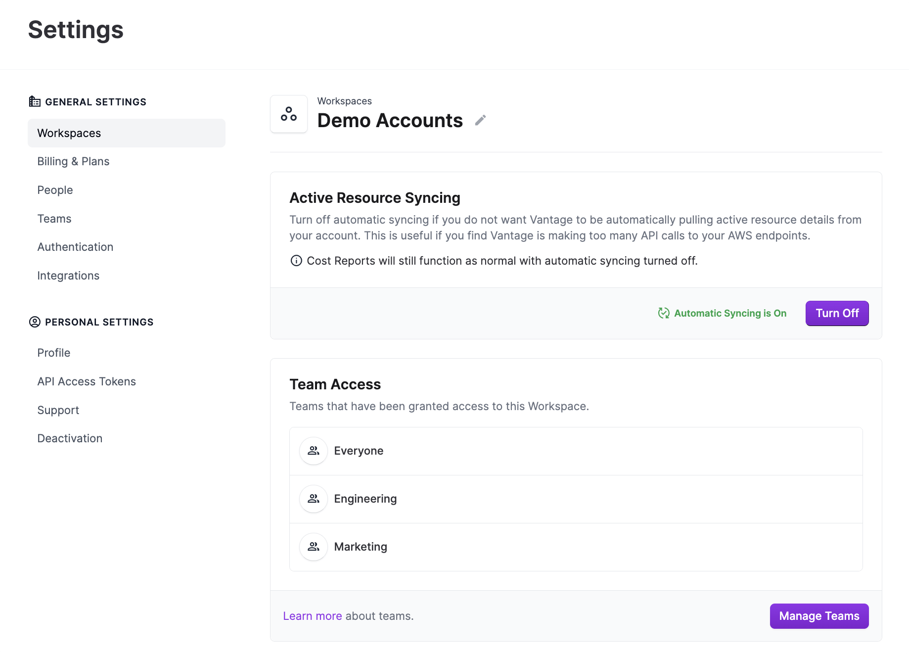
We now can streamline development and maintain consistency across interface elements, even when slight variations are required. For instance, within the same Settings UI, the Members and Access tabs differ slightly, where one includes a button while the other does not.
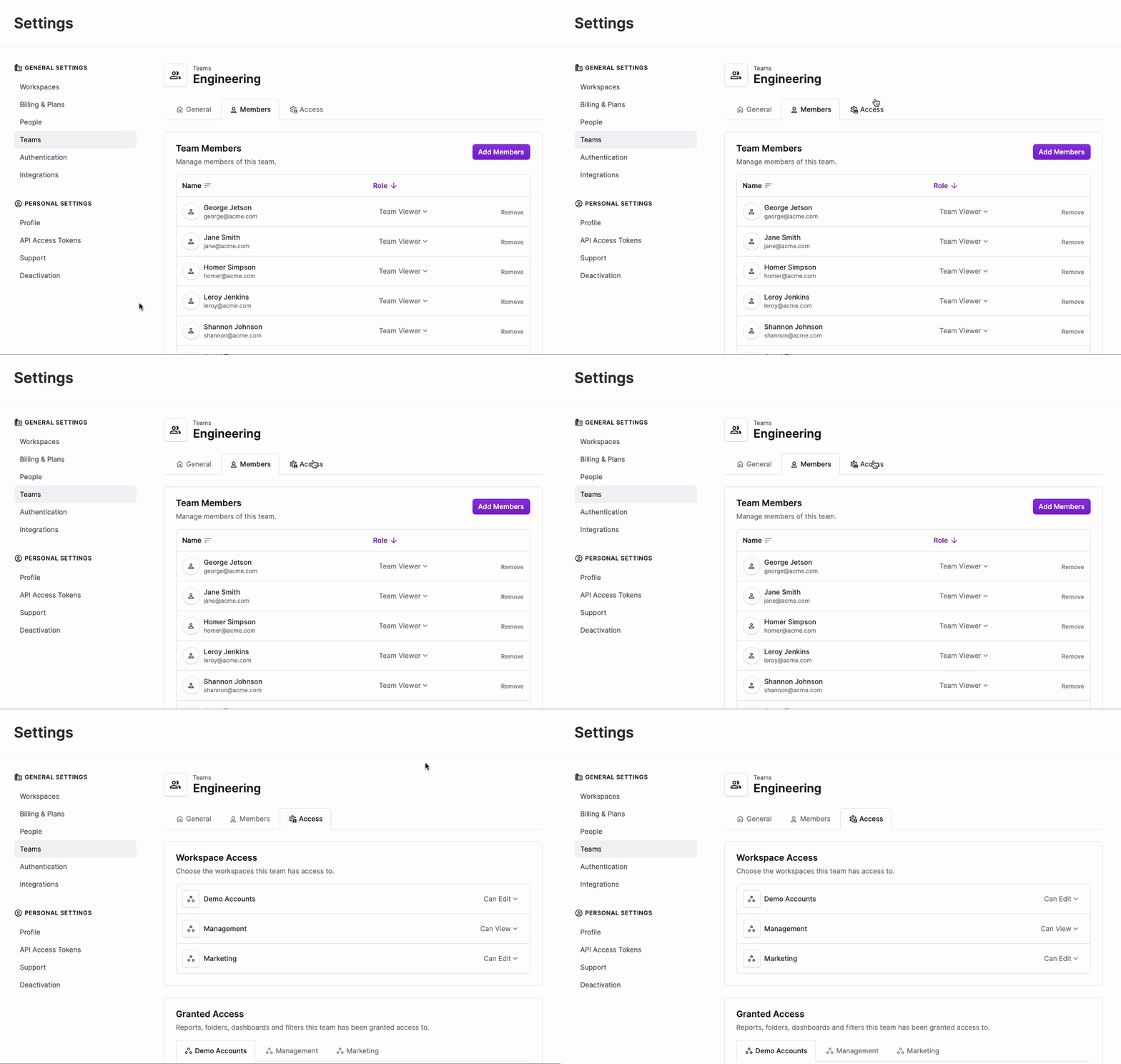
A traditional design system might treat each tab as a separate entity due to this discrepancy. With Tailwind, we can achieve near-identical styling for both tabs with minimal effort, differing only by the inline addition or omission of relevant classes. This level of granularity and flexibility ensures that our UI remains cohesive and visually coherent, while also reducing the need for duplicative code.
Improving Page Scannability
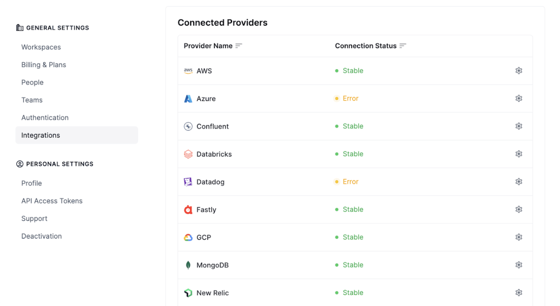
We adopted new layouts to enhance the readability and usability of our pages. Our previous provider integration layout was divided into a set of cards that proved difficult to scan. It was difficult to glean a high-level understanding of what was actually on that page without scanning both up and down and side to side.
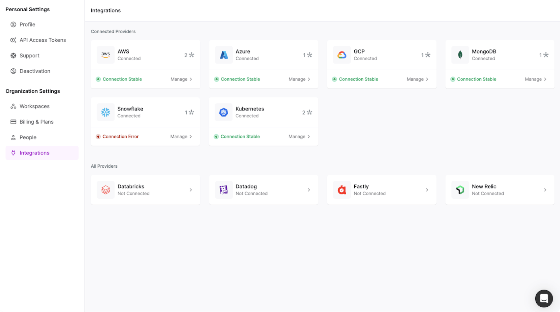
By organizing content into a logical list structure, we've made it easier for users to quickly scan and digest which integrations are available as well as their connection status, thereby improving the overall user experience. This layout was created directly in the browser using Tailwind, allowing for a quicker design while fully experiencing it from the user’s perspective.
What’s Next
While we pursue greater customization, one might question: Why not develop your own design system? As our application has undergone exponential growth in recent years, evolving alongside our expanding user base, we find ourselves continuously innovating. Yet, even with this growth, we're cautious not to confine ourselves to a rigid or inflexible design system. We want to customize without any framework or tooling to hinder our development process.
As our frontend migration continues, we'll continue to keep function at the forefront of our design process. We still have a lot of decisions to make, but the journey so far has helped us to establish a process for our rapidly scaling product. In a future article, we'll revisit some of these open questions and considerations and provide a comprehensive review of our experience.
Sign up for a free trial.
Get started with tracking your cloud costs.


